


Gold or Silver
Trade Ideas for the Active Investor

Many people have a fascination with gold and silver.
A conversation the other day brought up buying silver as an inflation hedge or/and protection from armageddon.
These concerns often involve a discussion of gold, silver, and, more recently, Bitcoin.
One wants to allocate to the best-performing asset.
The charts are effective at determining the trend of relative performance.
The Gold/Silver ratio chart is below.
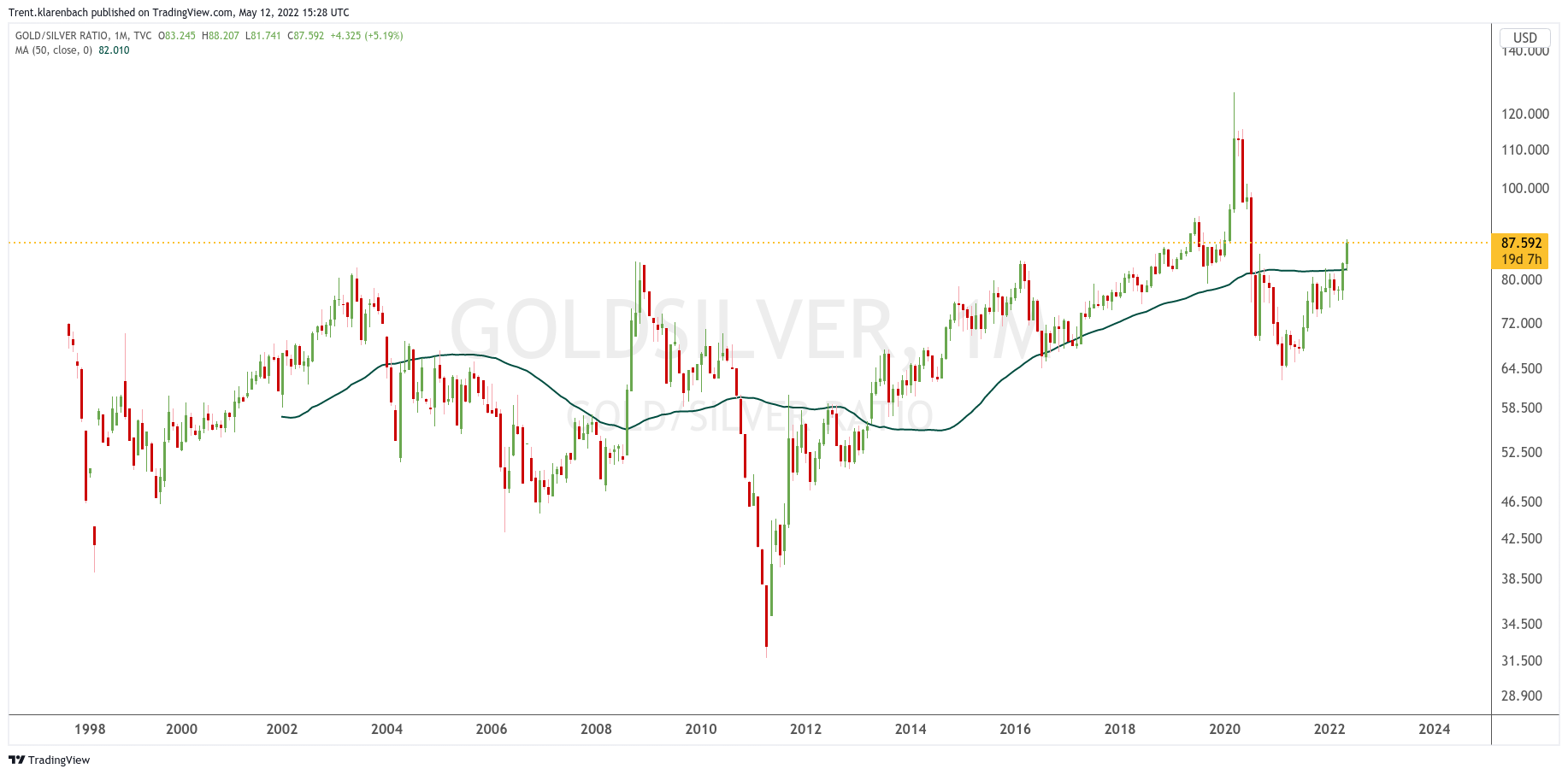
We can see how gold has recently begun outperforming silver on a relative basis and is back above the rising 50 Month Moving Average.
The Bitcoin/Gold ratio chart is below.
I shared a linear chart for dramatic effect.

One can see that BTC has produced much better returns than Gold for the past 11 years.
Six or so months ago, a buddy asked me about Bitcoin.
He is a bit of a gold bug, so I prepared this chart for him showing the line where I considered BTC to be a better alternative to Gold.
We can see that the double-top is complete, and the ratio is now in a downtrend on an intermediate timeframe.
I anticipate that the green 50 Month Moving Average will get tested, and the Own Bitcoin line will drop to that level.